- Index
- Chronology
- Neighborhoods
- Portfolio
- Ralph Haver
- Commercial
- Customs
- Characteristics
- Family Story
- Jimmie Nunn
- Civic Spaces
- Awards
- James Salter
- Multifamily
- Have a Haver?
Marlen Grove | 1952 | 10th Place and Bethany Home
The Way We Were
Reprinted with the gracious permission of ModernPhoenix member David Tyda and Desert Living Magazine, which originally ran the article in summer of 2005. Photography by Raul Garcia.
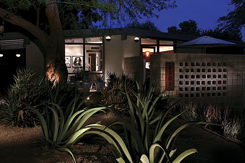
This mid-century modern home was recently purchased interior unseen. The new owners found poor construction, live wires, and layers of unwarranted paint.
They also found its soul. "We hadn't even closed on the house yet and I had already chosen the wallpaper!" says Daniel Germani. It's not like he simply walked into the local Dunn-Edwards to pick out a color. "I chatted up some antique shops in New York, did a lot of Internet research, and came up with a company in Sweden that sells vintage wallpaper. He had the exact pattern and color I wanted."
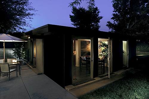
And with that wallpaper began a mission that led to one of the finest Ralph Haver home remodels we've seen in central Phoenix, AZ. Daniel Germani and Bobby Costa were living in North Scottsdale when they decided to make their first home purchase together. With the market hot for anything historic, unique, or centrally located, they knew their search would be filled with a series of emotional highs and lows as property in these parts moves fast. Their realtor called to inform them about a house that was two days from listing.
"We wrote the offer and submitted it the moment it listed. Since the home hadn't gone on the market yet, we couldn't walk through. We drove by and immediately knew we wanted it," he says. The first offer fell out of escrow, opening up the opportunity for Germani and Costa. Once the paperwork was complete, the remodel began. Architects had inhabited the dwelling previously, so a total overhaul wasn't necessary. Black slate floors throughout, Terrazzo tile in the bathroom, and high-end appliances allowed them to focus on other areas.
"We wanted to bring it back to its original beauty. Somewhere along the line, probably in the '70s, things took a turn for the worse here." Wood had been painted over, rooms had been closed off, and the home felt simply uninviting. The first order of business was to hire an architect. Enter Hayes McNeil of Inform Development.
"They knew exactly what they wanted, but needed someone to handle the scheduling and millwork, to basically allow them to live their lives while this home was being redone," says McNeil. "And if you know Daniel, letting go of the responsibility was a big challenge," he quips of his client, now a close friend.
 Germani studied architecture in his native Buenos Aires and has always been a design aficionado with a penchant for mid-century modern.
"I always admired Gropius, Mies van der Rohe, and Le Corbusier. These revolutionaries understood how appealing, low-cost urban housing could be. They stripped their projects of unnecessary ornaments and blurred the boundaries between indoors and out. I wanted our home to reflect this. So, we needed an architect with a precise vision, who could direct the process but understood, in the words of Mies, that 'less is more,'" he says.
As the to-do list grew, so did McNeil and Germani's knowledge of how a Haver home really ticked.
"It's not true that the only structural walls in these homes are on the perimeter," says McNeil in response to the common misbelief that a pitched roof and load-bearing exterior walls can allow homeowners to reconfigure the interior at their whims.
The home did not have a master suite "and the master bath was practically in the master bedroom, and there was little closet space," says Germani. So a hallway was created which closed off the master bathroom and separated the bedroom from the public areas. A storage system now separates the master bedroom from the adjacent volume. "We also learned the wiring was practically an afterthought in the original construction," says McNeil. "It's important to remember that these were the original middle-class tract houses, so the neighborhood electrician just threw the job together. We found live wires in the walls!"
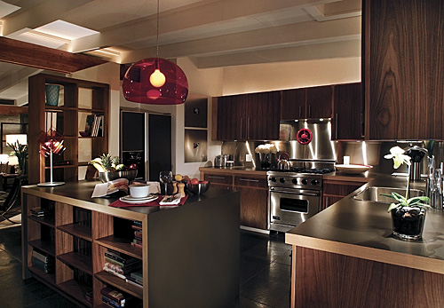
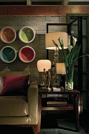
The kitchen was more forgiving. Although it was already outfitted with designer appliances, the cabinetry had been painted over and the bar/island was awkward in shape. So the cabinets were stripped, sanded, and reveneered to reveal a pleasing shade of wood and the bar was fitted with walnut bookshelves below - creating visual continuation from the living room's bookshelves - and cut in the same thickness and style as the office desk and bathroom vanity, again bringing a sense of total cohesion.  Every single window frame and door had to be stripped, as well as the wooden beams above, which revealed a gorgeous hue of dark walnut. The concrete brick was sandblasted to bring out its natural dark gray tone, providing a perfect base palate for the black slate floors, wood beams and cabinetry, and white gypsum. Modest in size, the 1,600-square-foot home has gone from three bedrooms to a master suite, guestroom, and office.
  "Fabulous is unapproachable," says Germani as he flips through European design magazines, pointing out how livable their spaces are. "People get caught up buying their million-dollar mansions, but where's their sense of individuality? Where's their personal taste?" he asks. "Everyone left this job with a sense of pride, and we've all become good friends." So maybe restoring a historic home is more than an act of architectural respect, it's also an opportunity to blend the way we were with the way we are.